This post may contain affiliate links. For more information, read my disclosure policy.
Hello there! It’s time for part two of the blog to business series. Today we’re talking all about tips for good blog design!
When you meet someone new, what’s the first thing you notice? Their teeth? Eyes? Smile?
When you go to someone’s house what’s the first thing you notice? The outside? The landscaping?
When you go to a new blog, what’s the first thing you notice? It’s probably the blog design. A good blog design can draw your readers in. A bad one can turn people away, even if the photos or recipes or content are perfect. Blog design is the first impression people get when they visit your part of the internet, so you need it to be good.
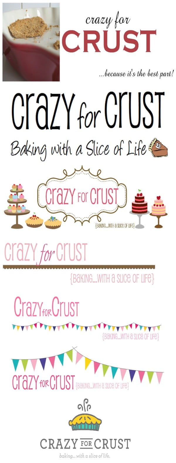
I think of my blog design here at Crazy for Crust as an evolution. Up until 2013 I designed my own headers, backgrounds, and buttons. Then, in February of 2013 I had paid for my first blog design from Nifty Thrifty Things and just a few weeks ago I again updated to the look I have now, from Purr Design.
From the beginning to now:
You can see how much I’ve changed since the beginning! I like each and every one for a different reason, but my newest logo is my favorite by far. It’s simple, gets the point across, and it’s got turquoise in it. 🙂
I’ve learned a few things about blog design over the past few years and I’m going to share some tips with you today. This isn’t a how-to post, but more of an overview of what (I think) makes a good design.
A good blog design is many things. Obviously, it’s a header and/or a logo, social media buttons, blog buttons, fonts, colors, layout, etc. But a good blog design is also much more than that, especially for a food blog. There are so many more things to think about: your photos, recipes, SEO, and on and on.
1. Buy your own domain.
If you still have a .blogspot.com or a .wordpress.com web address, I suggest you read this post and then head over to godaddy or namecheap.com. Buy your own .com and then redirect your current blogger or wordpress.com blog to the unique .com address. People will immediately think you’re more legit if you have your own domain.
I can’t help you actually move your domain – it took me hours and tears 4 years ago before I started. Check these instructions for blogger or these instructions for wordpress.com.
If you’ve been blogging for awhile already, be sure to make sure to check on how to redirect your old blog name to your new one. (Instructions for wordpress.com; blogger is supposed to do that automatically.)
2. Think about switching to self-hosted Wordpress.
I started my blog on blogger. It was great, it was free, and it helped me to grow with less cost. However, when I switched to Wordpress, my traffic increased. I can control my SEO features for each post and I own my own content. There are all sorts of fancy plugins that do all sorts of fancy things, and I feel like it is viewed by some as a “more professional” platform. (No judgements – that’s just what I’ve heard.)
I did a whole series on moving from Blogger to Wordpress and how I did it.
3. Think about getting a professional to design your blog (or at least a logo).
Now, there are lots of ifs and buts in this section, just to clarify.
First, if you’re a brand new blogger and you don’t know what you want or where you’re going with your blog, I suggest you do one of two things:
- Use a cheap or a free template you find from a reputable source. (On blogger this is easy, on Wordpress it’s a little harder.) Use this template until you figure out what you’re doing and where you want to go, then pay for someone to design it for you.
- Do some DIY blog design. This is especially easy on blogger. Ashton has a whole category on DIY design. Play with a few things until you figure out your identity, then go for a real “big girl” design.
Second, the caveat, if and but:
If you have any inkling of you who are as a blogger or you want to turn your blog into a business, hire someone who knows what they’re doing (unless you or your spouse is a designer/techie who knows what they’re doing).
I can tell you from experience – once I got my first “real” blog design in 2013 I relaxed a little. I’d paid for a design and I didn’t have to tinker any more. My blog did what I wanted it to and I didn’t have to spend hours searching chat rooms and help posts and holding my breath while I changed html code.
Now, with this new design, I’m even happier. It’s everything I want in one place, and I have a snazzy logo to go with it.
I know that blog design is expensive, but what they say is true. You gotta spend money to make money sometimes.
4. Simple is better.
(Now this doesn’t apply to everyone, of course. I’m speaking about in general.)
When you’re thinking about actual blog design, simple is better. You want your food and your photographs to stand out – not your background. You want people to be able to see your social media buttons.
Think about it this way: you go to your husbands’ office party and there’s this lady wearing this hugely loud and crazy print shirt with mismatched pants. She’s crying and you ask her why and she says no one noticed her new hair.
The same goes with blog design. Patterns are fine, but subdue them. Colors are great, but don’t let them overwhelm the content. Obviously, my blog is a lot of white. I like simple, clean lines. That’s not the look for everyone (and we wouldn’t want that, difference is what makes us great) but think about what you want to showcase and make sure that stands out.
My biggest pet peeves with blog design:
- Music. Hate to say it – if it’s playing music I close the window immediately.
- Backgrounds that move, like snow. That just freezes my browser.
- Black (or any dark) text area and white (or yellow) words. It makes my eyes hurt.
- Fonts I can’t read. Hey, I love a font more than anyone. But if it’s the text of your post, go with something simple and readable and boring, please.
5. Layout is really, really important.
Okay, so people are at your blog. They stayed around to check out your food. Now you need to make sure they can navigate properly.
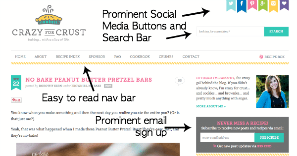
Every theme is different, but in most platforms you can at least arrange the order of your sidebar. Make sure your social media buttons are up high, not buried between ads. You want people to follow you – make it easy! And make sure that those buttons open a new window or tab when clicked. As a savvy internetarian, I use right click on every link. Normal people don’t.
Make sure your search bar is up high too. Make it prominent!! That’s one of the things that bothers me the most – when I cannot find the search bar. If I’m looking for your search bar it’s because I want to feature you in a round-up and if I don’t find your search bar in my first scroll, I’m out.
Also related to the search bar: try a search on your blog. What do you get? Snippets? Images? Or full posts? Please – if you’re getting full posts on search, figure out how to have it show a snippet instead. Wordpress search is especially horrid out of the box and when I search I often get full posts so I have to scroll through pages and pages to find what I’m looking for. {Really, I don’t do that. That’s my cue to exit.}
Have an easily readable navigation bar. Have an about tab so I can read about you. Have a recipe page (more on that below). Tell me how I can contact you, with an email address not a contact form. I never know if my email goes through or if it ends up in the Dorothy’s email box in Oz.
6. Recipe Pages are one of the most important parts of your blog.
I’ll repeat: if you run a food blog, your recipe index is probably the most important part of your blog.
People come to your blog to find good recipes. You want them to come read a post, and stay for more. If they can’t find anything else they like, they won’t stay.
Here are my tips for good recipe pages:
Have categories for each type of food: Entree, Breakfast, Drinks, Dessert, etc. In a perfect world you’d have sub-categories (or often nested categories) for each type. Chicken or Beef or Casserole in your entree category or cupcakes or pie in your desserts. I can’t tell you how many times I go to blogs that don’t break out their desserts. I’m a dessert blogger. I eat chicken, but I really just care about your cookie recipes. I hate scrolling. You should know that by now.
If you can, make a visual recipe index. Remember, we eat with our eyes first. Some WP themes have this built in. You guys are lucky. If you don’t have them built in, there are several different tutorials out there on how to do it yourself.
- How to create an automatic visual recipe index for wordpress blogs by Chocolate Moosey
- How to make a visual recipe index by Je Suis Alimentageuse and Part 2.0
- How to create an automatically updating visual recipe index in blogger by Barefeet in the Kitchen
- How to make a visual blog index page by Julie’s Eats and Treats
Or, if you hire a designer, they can do it for you. 🙂
7. Printable Recipes are very important.
I’ll never forget when I first started my blog and a mom at soccer told me she pressed print on a recipe and came back 20 minutes later and it had printed, like, 70 pages. That was mortifying. You need a good print option on your blog.
On blogger, this is more difficult. You can use a google doc and link to it in your post. Or, do what Mary of Barefeet In The Kitchen does. Create a second blogger site (title it yourblog-recipes.blogspot.com). Make it look just like your site (install the same stuff, but no ads or extras on the page). Publish your recipe only on that second site, then link to it in your post. See her method in action here. (Scroll down to the recipe and click printable recipe.)
In Wordpress you have lots of options in the way of plugins. The two that come to mind most readily are Ziplist and Easy Recipe. Both have their pros and cons. Either way, you get a print button. And that’s important!!
8. Categorize and Tag, Tag, Tag.
So I told you how important recipe pages are but almost as important are categories and tags. Categories and tags are often how someone finds something on your blog if search isn’t working or if your search returns full posts.
Categories should be broad. Cake, pie, ice cream, chicken, bread, etc. These are the main recipe categories you use for your recipe index. Every recipe should be categorized in one of your many categories. People can find your categories by going to your recipe pages, or by using a drop down category bar on your site.
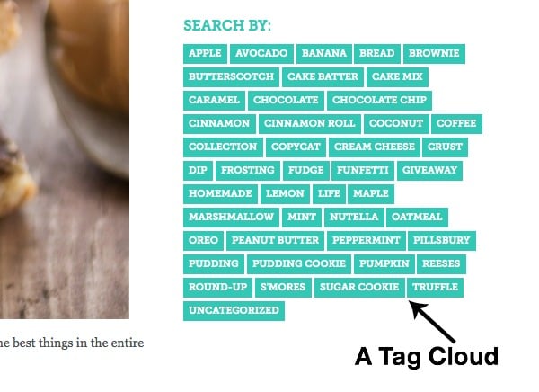
Tags are more specific. Chocolate, peanut butter, tacos, gluten-free, caramel, etc. Each of my recipes is tagged with main ingredients and then I have a tag cloud in my sidebar. Looking for something? Click your favorite ingredient and you have all my posts tagged with that flavor.
For example, Payday Fudge is categorized as Candy and Halloween. It’s tagged with candy corn, copycat, fudge, peanut butter, and peanuts. Click on any of those in the tag cloud and Payday Fudge will show.
It’s just another layer of searching. Make it easy for your readers to find what they want, and they’ll come back for more.
Want to reorganize your categories and tags? On WP use the category to tag converter.
9. Consider truncating your posts on the home page.
Truncating is a hot-button issue but if your homepage is full of full posts, you’re losing a lot of valuable real estate. Consider a home page like Wine & Glue with truncated snippets. Her home page is coded to look like that. Lots of WP themes are like that too. Or, if a bunch of snippets isn’t your thing, try a page like mine or Averie Cook’s where a lot of the first post is shown, but below are snippets. This is especially important on the blogger platform because unless you truncate or have a theme, your full posts show.
To truncate in blogger you use the “more” tag. It looks like a ripped piece of paper.
In WP, depending on your theme, you also truncate using the “more” tag. It’s that icon that is two rectangles with a dotted line between. You may also need a plugin to make it truncate on your home page. Check with your theme support to make sure it’s done correctly.
10. Your sidebars are valuable real estate.
I’m still in the process of filling my side bars with the things I want, since my re-design. The most important thing about your sidebar (besides your ads) is to keep people on your site longer. Show your recent posts, feature some popular posts. On my old site I had large images in my sidebar, linked to posts. Put a box for your email sign-ups. Have your social media buttons, your tag cloud. Don’t make it too busy, but use that to keep people on your site!
11. My favorite Wordpress Plugins:
- Comment Reply Notification. This is super important. Why spend all that time responding to comments if no one gets an email?
- Akismet + NoSpamNX. Lately Akismet has been missing spam. Since I installed both I haven’t had to filter any!
- RSS No More. This truncates your post at the more tag. It’s super helpful when you truncate your feed for RSS and for emails because I can put the more tag wherever I want and a picture and text will show in feeds. It is so, so important for an image to show in your feed/email. No one will click over if it doesn’t!
- WordPress SEO. This is an essential plugin for me for SEO. You enter your keyword and description and it lets you know if you’re green (aka good to go) or red (aka…not). Also, if you transfer themes or frameworks, it remembers and goes with you. Not all SEO plugins do that!
- Permalink Finder. This has been super helpful for me because I switched from blogger. It re-directs people so they don’t get 404 error pages (also helpful when you’re doing a link up and your link is broken…it finds the right one!)
- Coschedule. Oh my gosh. This deserves it’s own post. This plugin has literally saved my life. It’s $10 a month but it let’s you schedule so much of your social media from in your post. Plus, it’s a calendar so you can easily see what you have scheduled when and move things around. Totally invaluable!
- CommentLuv. I haven’t put this one back yet, but I love it. It’s easy for me to click over and visit other blogs while I’m replying to comments.
And that’s it. My $.02 on blog design. What did I forget? What do you think makes a good blog design? Leave your advice in the comments!
Read the other posts in this series:
Blog to Business: 7 Tips for Finding your Blogging Community
Thank you! Thank you! I used your post as a tutorial to walk me through updating my new lupus/food blog. Thank you for providing this valuable material.
So many good links here to try. Thanks for this series!
How happy I am to find your blog! Its a treasure and a must visit for all Bloggers. Thanks a ton for sharing such valuable info. There’s so much to learn from you!
I am still on Blogger. I want to mve to wordpress, but have no idea how to start. Any steps or tips on, that would be awesome. Thanks for these posts, Dorothy! You can email with info, if you want.
I wrote a couple posts back when I did it (https://www.crazyforcrust.com/2012/09/moving-from-blogger-to-wordpress-the-why-and-what/). Feel free to email me any questions Mandy! 🙂
Ok, I have seriously looked back at this post like 10 times already this week. My blog is a MESS!! Thanks so much for all this great advice Dorothy, it is much appreciated! 🙂
I’m glad to find your blog and I can read your tips. I want to write a blog too and your tips are great! 🙂 Thanks!! 🙂 I read your recipes from Hungary (in the middle of Europe). I like your cookies and I have already baked severals.
Thank you Katalin!! 🙂
Featured In